CASE STUDY 01 — GSA / U.S. Open Government
From data graveyard to public accountability service
Redesigning the U.S. Open Government website from a fragmented content repository into a clearer, more accessible transparency experience.
- Role
- Project manager and led content strategy, IA, and service design framing
- Scope
- CMS migration, IA, content design, governance, accessibility
- Tools
- Drupal · Miro · Google Analytics · Mouseflow · Siteimprove
- $125KAnnual savings
- 40%Faster navigation and search
- 22%Lower bounce rate
- 12%Engagement lift
02 / Project snapshot
The project at a glance
- Organization
- U.S. General Services Administration / U.S. Open Government
- Project type
- CMS migration, content redesign, service design framing
- Timeline
- Approximately 9 months from discovery through launch
- Team
- Content, product, engineering, agency SMEs, and accessibility/compliance reviewers
- Primary audiences
- Researchers, journalists, civil society partners, agency stakeholders, and members of the public
- My role
- Project manager and led content strategy, IA, and service design framing
- Core challenge
- Turn a fragmented public information site into a clearer accountability experience
- Key focus areas
- Information architecture, plain language, content patterns, accessibility, stakeholder alignment, governance, progress tracking
- Outcomes
- Improved discovery, engagement, accessibility, operations, and public access to accountability information
03 / Problem
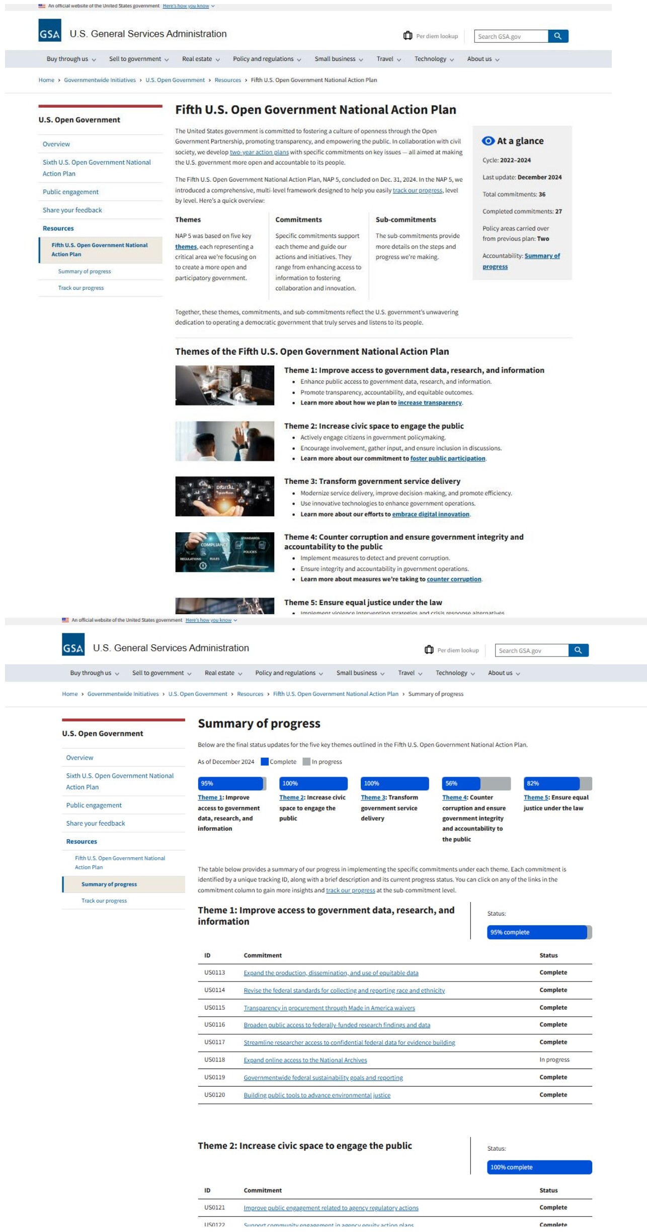
The site had become a “data graveyard.”
The project began as a CMS migration, but the real problem was a service failure. People could not easily find, understand, or act on U.S. Open Government information.
For researchers, journalists, civil society partners, and members of the public, the legacy site created friction at every step: find information → understand commitments → review progress → verify evidence → participate. Important information was available, but it was buried under fragmented navigation, dense content, inconsistent structure, and government-centered terminology.
The site needed more than a new CMS. It needed a clearer service model for transparency, accountability, and public participation.
04 / My role
Connecting public needs with internal systems
I led the content strategy and service design framing for the U.S. Open Government CMS migration and redesign. My work connected the public-facing experience with the internal systems needed to support it over time.
I led
- • Content strategy and service design framing
- • Information architecture and page hierarchy
- • Reusable content patterns and templates
- • Governance guidance and editorial standards
- • Plain-language navigation and labels
I partnered with
- • Product and technical teams
- • Agency stakeholders and policy leads
- • Subject matter experts
- • Digital communications team
- • Accessibility and compliance reviewers
05 / Goal
Make accountability information usable
Shift the site from a static content repository into a more usable public accountability service that helps people complete four core tasks.
- FindU.S. Open Government information quickly.
- UnderstandCommitments and progress at a glance.
- ReviewSupporting evidence and source materials.
- ParticipateThrough meetings, downloads, comments, and feedback.
06 / Public journey
Mapping the public accountability journey
I reframed the experience around the steps people take when seeking government accountability information. This journey became the backbone for the redesign.
| Stage | Public need | Pain point | Design response |
|---|---|---|---|
| Find information | Locate relevant topics | Navigation was fragmented | Plain-language labels and topic-based information architecture |
| Understand progress | See what changed | Progress was hard to scan | Dashboard-style progress views and summaries |
| Review evidence | Verify claims | Reports and data were scattered | Evidence grouped by topic, commitment, and source material |
| Participate | Take action | Calls to action were unclear | Clear pathways to subscribe, attend, download, comment, and share feedback |
Instead of organizing the site around internal structures, the new experience helped people move through a clearer path: topic → commitment → progress → evidence → participation.
07 / Service blueprint snapshot
Connecting the visible experience to the system behind it
The redesign connected what people saw on the surface with the internal systems required to keep the service useful and sustainable.
What the public sees
- • Navigation
- • Content pages
- • Dashboard views
- • Calls to action
- • Feedback paths
What ties it together
- • Reusable templates
- • Plain-language standards
- • Topic-based IA
- • Progress-tracking patterns
What supports the experience
- • CMS structure
- • Content governance
- • Review cycles
- • Stakeholder approvals
- • Accessibility requirements
- • Reporting workflows
08 / Key design decisions
Design decisions that changed the service
Decision 01
Reframed the migration as a service redesign
Problem it solved: The team risked copying legacy problems into a new CMS.
Result: Set a people-first vision that guided every downstream decision.
Decision 02
Organized content around public tasks
Problem it solved: The legacy site reflected internal structures, not how people searched.
Result: People could move from topics to commitments, progress, evidence, and participation.
Decision 03
Used dashboard-style summaries
Problem it solved: Progress and accountability information were buried in dense pages.
Result: Made commitments and status easy to scan, compare, and verify.
Decision 04
Created reusable content patterns
Problem it solved: Updates were inconsistent and slow to publish across teams.
Result: Internal teams could publish updates more consistently after launch.
Decision 05
Built accessibility into structure and content
Problem it solved: Dense layouts and jargon excluded many readers.
Result: Met Section 508 and WCAG requirements; improved access for assistive tech users.
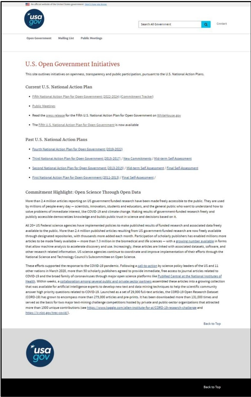
09 / Before and after proof
Three paired examples
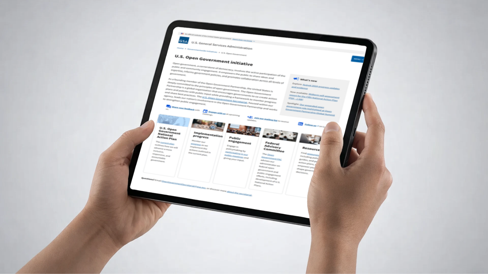
Homepage
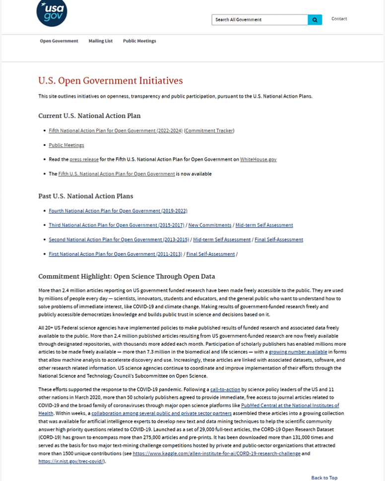
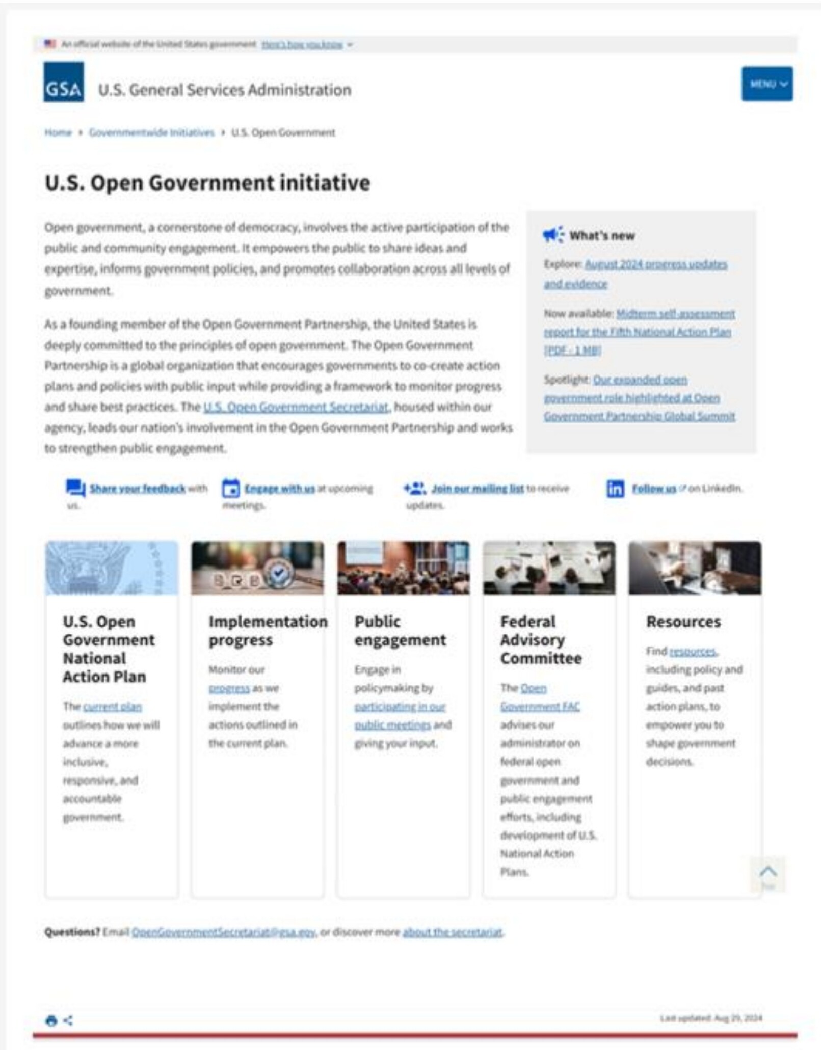
Why it matteredPeople could orient themselves and choose a path in seconds, instead of scanning long lists of agency-named links.
Commitment tracker
Why it matteredPeople could understand progress without digging through dense reports or scattered links.
Public engagement
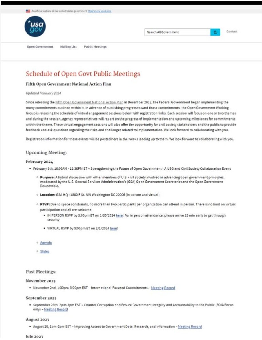
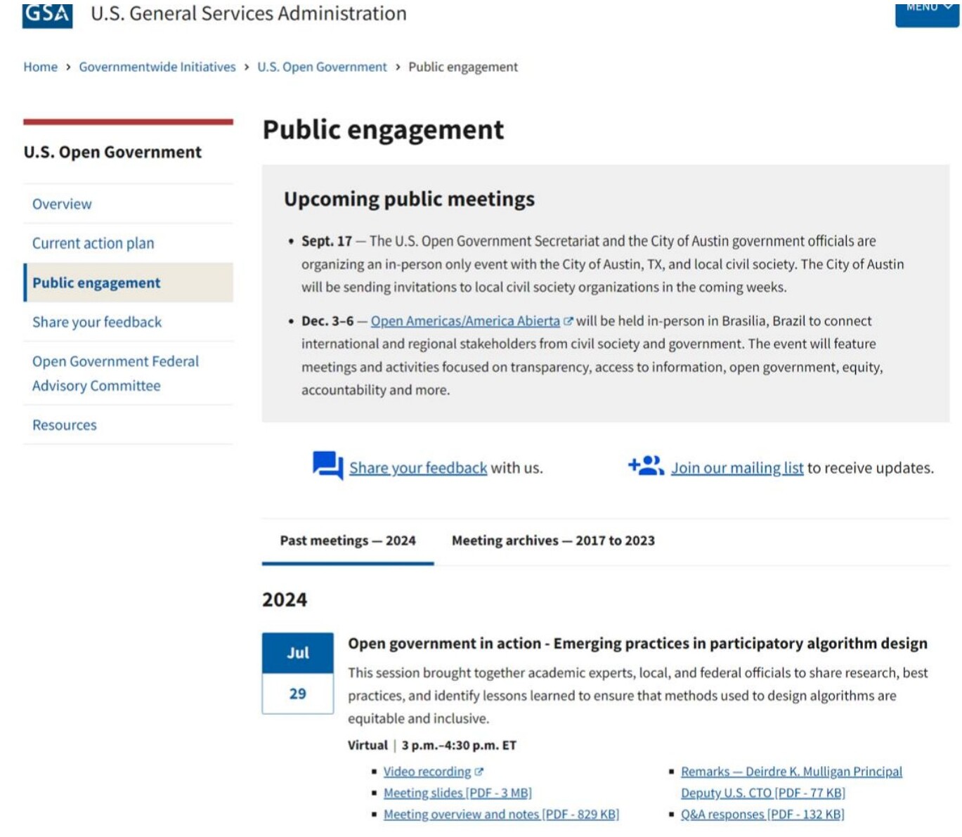
Why it matteredPeople could move from interest to action — joining a meeting, subscribing, or sharing feedback — without hunting for instructions.
10 / Impact
Lift across discovery, access, and accountability.
The redesign connected service decisions to measurable improvements in discovery, engagement, accessibility, and operations.
Metrics are based on analytics and site performance comparisons before and after launch, including navigation behavior, engagement signals, bounce rate, and operations cost data.
Annual savings
Reduced outsourced support for legacy site operations and maintenance
Improved navigation and search completion
Based on tracked clicks and successful search behavior
Lower bounce rate
People found more relevant paths through redesigned content
Engagement lift
Based on session duration, pages per visit, and unique visitors
Accessibility requirements met
Through improved structure, headings, links, and plain language
- • Diagnosed service failures hidden inside content and platform problems
- • Translated complex government information into clearer public experiences
- • Connected frontstage touchpoints with backstage workflows
- • Facilitated alignment across policy, communications, and technical teams
- • Turned a CMS migration into a measurable service design opportunity
11 / Reflection
What I learned
Lesson 01
A migration can reveal a service problem.
The platform was not the only issue; the deeper challenge was how people accessed and understood accountability information.
Lesson 02
Content structure is service design.
Labels, hierarchy, summaries, and governance shape whether people can use a public service effectively.
Lesson 03
Trust depends on both clarity and operations.
People need clear information, but teams also need sustainable workflows to keep that information current.
12 / Final positioning
Turning complexity into clearer public services
This project shows how I turn complex, high-stakes information ecosystems into clearer, more accessible digital services that help people find answers, understand progress, and take action.